...maybe I should explain how I got to that number, or, how I title my paintings.
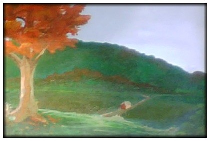
This was my first painting on canvas, in acrylics, completed when I was about 15. It was probably titled something silly like, "Valley in Vermont" or some other sad trope. But in college, my school was directly across from the Museum of Fine Arts in Boston, and I spent an inordinate amount of time within it's halls. One thing I noticed is that as soon as someone was drawn to a painting, the first thing they would do is read the label giving the title, artist name, and other details. While I did not know what went through the viewer's mind, sometimes this info would cause them to completely abandon a painting they were otherwise drawn to. Most landscapes were either named after the place, or the place was included in the information. I wondered if a person's preformed idea of a place would alter their relationship with a painting of that place.
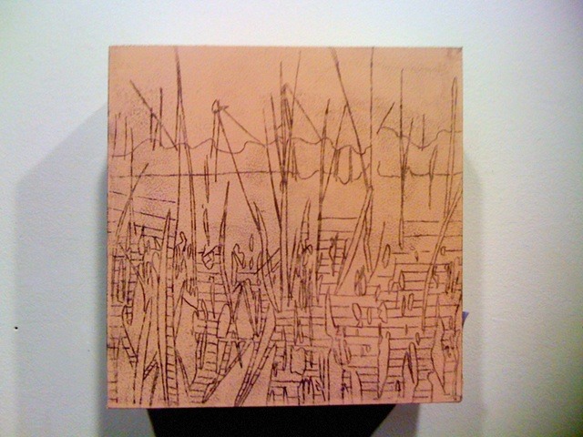
So I wanted nothing at all to do with titles that would influence my viewers relationship with my paintings. Being a giant fan of 70's minimalism, I went with "untitled landscape #_" for my titles. But having to start somewhere with a number sequence, I retroactively gave the above painting the honor of "untitled landscape #1" as it was the my first truly successful (for reasons perhaps only known to me) landscape painting in oil.

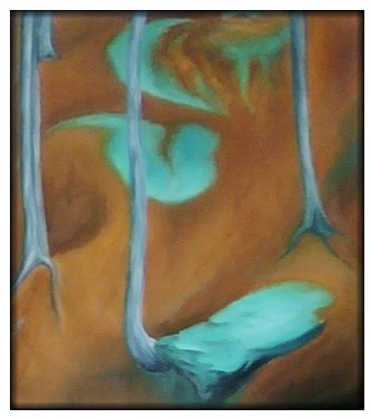
But gallery owners HATE untitled series #_ and want real, pretty titles. To be dead honest, I kind of agree with them and acquiesced for the simple reason that keeping straight the difference between painting #37 and #38 on numbers alone, two months, let alone two years down the line, is a giant chore. But keeping the system already in place, I shortened "untitled landscape #" to simply "ul#" and added on a title in parenthesis. So the above image is "ul 25 (a tribute to Georgia O'Keefe)."
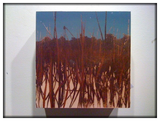
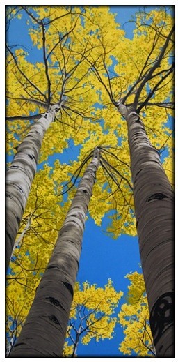
Most of the the time, the titles are not so specific, as once again, I care not to influence a viewer's idea of a painting with something as benign as a title. But it was the view from her front porch in Ghost Ranch, New Mexico, so in this case I made an exception. Besides, I've had a poster of one her paintings since I was like seven. It is the least I could do to repay the favor of her works' influence on me. Mostly painting titles come from songs I had running through my head at the time, like the one above "ul 50 (samson)."
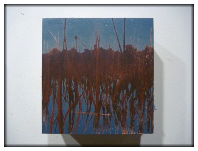
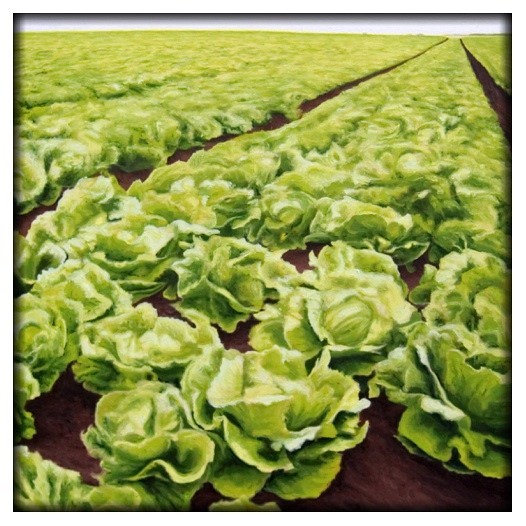
Or, when they are a series or body of work, track names from the album I had playing in my studio at the time. Vainly, I hope one day to have a retrospective at a big museum. Then, instead of the audio tour with some narrator waxing philosophic about the lengths I went to create, the influences on my work, my intentions, etc. (for which you have this blog, my dear reader, minus the annoying voice over), you can take the other option, simply a soundtrack of each painting's song when you stand in front of it. For the one above, "ul 75 (the bagman's gambit)," you would be listening to The Decembrists in my pipe dream retrospective.
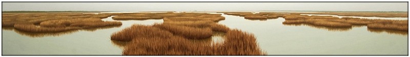
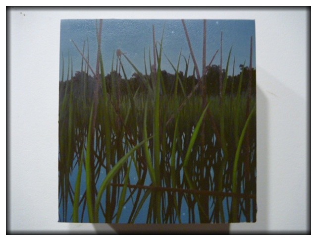
Which brings me to my latest painting, "ul 100 (carriers of the light)." The song is by Brendan James, and explains why he continues to sing. I thought it fitting, for not only having an infectious tune, it also could explain why I continue to paint. And hopefully this extremely long blog post also explains how much I think about you as the viewer, and thank you for viewing, and caring for and about, my paintings. Thanks, and on to 101!
-jb.